Module js-draw - v1.21.1
js-draw
For example usage, see one of the examples or read the documentation.
Features
Very large zoom range
A core feature of js-draw is its large zoom range (from roughly 10⁻¹⁰x to 10¹⁰x).
Demo
Applications using js-draw can adjust this zoom range with custom EditorSettings.
Touchscreen and stylus support
js-draw supports touchscreen pinch zoom and rotate gestures. To simplify editing, screen rotation snaps to multiples of 90 degrees.
Demo
It's also possible to disable touch drawing. This can be useful when drawing with a stylus and can be done with either PanZoomTool.setMode or, by a user, with the "hand" tool menu:
User-configurable tools
With the default toolbar, users can change the pen style, color, and more:
It's possible for applications using js-draw to add custom pen types that can also be customized in this way. It's also possible to save the toolbar state and restore it after reloading the app.
More features
js-draw also supports:
-
Partial stroke erasing
-
Saving to and loading from a subset of SVG
API
Creating an Editor
With a bundler that supports importing .css files
To create a new Editor and add it as a child of document.body, use the Editor constructor:
import Editor from 'js-draw';
import 'js-draw/styles';
const editor = new Editor(document.body);
The import js-draw/styles step requires a bundler that can import .css files. For example, webpack with css-loader.
With a bundler that doesn't support importing .css files
Import the pre-bundled version of the editor to apply CSS after loading the page.
import Editor from 'js-draw';
import 'js-draw/bundledStyles';
const editor = new Editor(document.body);
js-draw/bundledStyles is a version of the editor's stylesheets pre-processed by Webpack. As such, importing or including it with a <script src="..."></script> tag applies editor-specific CSS to the document.
Without a bundler
If you're not using a bundler, consider using the pre-bundled editor:
<!-- Replace 1.0.0 with the latest version of js-draw -->
<script src="https://cdn.jsdelivr.net/npm/js-draw@1.0.0/dist/bundle.js"></script>
<script>
const editor = new jsdraw.Editor(document.body);
editor.addToolbar();
editor.getRootElement().style.height = '600px';
</script>
Note: To ensure the CDN-hosted version of js-draw hasn't been tampered with, consider including an integrity="..." attribute. Read more about using SRI with JSDelivr.
Adding a toolbar
To create a toolbar with buttons for the default tools:
const toolbar = editor.addToolbar();
Save and exit buttons can be added with the .addSaveButton and .addExitButton methods:
toolbar.addSaveButton(() => {
const svgElem = editor.toSVG();
console.log('The saved SVG:', svgElem.outerHTML);
});
toolbar.addExitButton(() => {
// Save here?
// Removes the editor from the document.
editor.remove();
});
Custom actions can also be added to the toolbar. For example,
toolbar.addActionButton('Custom', () => {
// When the action button is pressed
});
or alternatively, with an icon,
toolbar.addActionButton({
label: 'Custom',
icon: editor.icons.makeSaveIcon(),
}, () => {
// Do something here
});
Loading from SVG
editor.loadFromSVG(`
<svg
viewBox="156 74 200 150"
width="200" height="150"
>
<path d="M156,150Q190,190 209,217L213,215Q193,187 160,148M209,217Q212,218 236,178L232,176Q210,215 213,215M236,178Q240,171 307,95L305,93Q237,168 232,176M307,95Q312,90 329,78L327,74Q309,87 305,93" fill="#07a837"></path>
</svg>
`);
Note: While js-draw supports only a small subset of the SVG markup language, it tries to preserve unrecognised SVG elements.
For example, although js-draw doesn't support <circle/> elements,
renders as
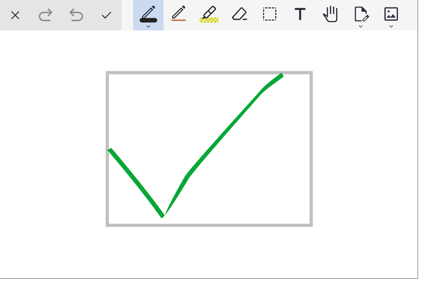
but exports to
which does contain the <circle/> element.
Customizing the background
The background color and style can be customized with editor.setBackgroundStyle. For example,
import { Editor, Color4, BackgroundComponentBackgroundType } from 'js-draw';
const editor = new Editor(document.body);
editor.dispatch(editor.setBackgroundStyle({
color: Color4.orange,
type: BackgroundComponentBackgroundType.Grid,
}));
Above, we use editor.dispatch because setBackgroundStyle returns a Command, rather than changing the background style directly. js-draw uses Commands to track actions that can be undone and redone.
By default, .dispatch adds Commands to the undo stack. To avoid this, pass false for the second parameter to .dispatch:
const addToHistory = false;
editor.dispatch(editor.setBackgroundStyle({
color: Color4.orange,
type: BackgroundComponentBackgroundType.Grid,
}), addToHistory);
Making the background fill the screen
By default, the background has a fixed size and marks the region that will be saved by .toSVG or .toDataURL. It's possible to make the background auto-resize to the content of the image with editor.image.setAutoresizeEnabled(true):
const editor = new Editor(document.body);
const addToHistory = false;
editor.dispatch(editor.image.setAutoresizeEnabled(true), addToHistory);
// Alternatively, using .setBackgroundStyle:
editor.dispatch(editor.setBackgroundStyle({ autoresize: true }), addToHistory);
Saving
To save as an SVG, use editor.toSVG(), which returns an HTMLSVGElement. Alternatively, if working with very large images that need to be saved in the background, consider using editor.toSVGAsync().
It's also possible to render the editor to a PNG or JPEG data URL. This can be done with editor.toDataURL().
The region of the image that will be saved can be changed by calling editor.image.setImportExportRect or
Settings/configuration
Disabling touchpad panning
Touchpad/mousewheel pan gestures can conflict with gestures used to scroll the document. To turn off touchpad pan gestures (and scrolling the editor with the mousewheel),
const editor = new Editor(document.body, {
wheelEventsEnabled: false,
});
Alternatively, to only enable touchpad panning when the editor has focus,
const editor = new Editor(document.body, {
wheelEventsEnabled: 'only-if-focused',
});
Localization
If a user's language is available in src/localizations/ (as determined by navigator.languages), that localization will be used.
To override the default language, use getLocalizationTable([ 'custom locale here' ]). For example,
const editor = new Editor(document.body, {
// Force the Spanish (Español) localizaiton
localization: getLocalizationTable([ 'es' ]),
});
Creating a custom localization
See src/localization.ts for a list of strings that can be translated.
Many of the default strings in the editor might be overridden like this:
const editor = new Editor(document.body, {
// Example partial Spanish localization
localization: {
// Not all translated strings need to be specified. If a string isn't given,
// the English (default) localization will be used
// Strings for the main editor interface
// (see packages/js-draw/src/localization.ts)
loading: (percentage: number) => `Cargando: ${percentage}%...`,
imageEditor: 'Editor de dibujos',
undoAnnouncement: (commandDescription: string) => `${commandDescription} fue deshecho`,
redoAnnouncement: (commandDescription: string) => `${commandDescription} fue rehecho`,
// Strings for the toolbar
// (see src/toolbar/localization.ts)
pen: 'Lapiz',
eraser: 'Borrador',
select: 'Selecciona',
thicknessLabel: 'Tamaño: ',
colorLabel: 'Color',
...
},
});
Setting the minimum and maximum zoom
By default, the editor's minimum and maximum zoom are very large (2·10-10x and 1012x, respectively). These are configurable by the minZoom and maxZoom settings. For example,
const editor = new Editor(document.body, {
minZoom: 0.5,
maxZoom: 2,
});
Changing the editor's color theme
The editor's color theme is specified using CSS. Its default theme looks like this:
.imageEditorContainer {
/* Deafult colors for the editor -- light mode */
/* Used for unselected buttons and dialog text. */
--background-color-1: white;
--foreground-color-1: black;
/* Used for some menu/toolbar backgrounds. */
--background-color-2: #f5f5f5;
--foreground-color-2: #2c303a;
/* Used for other menu/toolbar backgrounds. */
--background-color-3: #e5e5e5;
--foreground-color-3: #1c202a;
/* Used for selected buttons. */
--selection-background-color: #cbdaf1;
--selection-foreground-color: #2c303a;
/* Used for dialog backgrounds */
--background-color-transparent: rgba(105, 100, 100, 0.5);
/* Used for shadows */
--shadow-color: rgba(0, 0, 0, 0.5);
/* Color used for some button/input foregrounds */
--primary-action-foreground-color: #15b;
}
@media (prefers-color-scheme: dark) {
.imageEditorContainer {
/* Default colors for the editor -- dark mode */
--background-color-1: #151515;
--foreground-color-1: white;
--background-color-2: #222;
--foreground-color-2: #efefef;
--background-color-3: #272627;
--foreground-color-3: #eee;
--selection-background-color: #607;
--selection-foreground-color: white;
--shadow-color: rgba(250, 250, 250, 0.5);
--background-color-transparent: rgba(50, 50, 50, 0.5);
--primary-action-foreground-color: #7ae;
}
}
To override it, use a more specific CSS selector to set the theme variables. For example,
/* Notice the "body" below -- the selector needs to be more specific than what's in js-draw */
body .imageEditorContainer {
--background-color-1: green;
--foreground-color-1: black;
/* For this theme, use the same secondary and tertiary colors
(it's okay for them to be the same). */
--background-color-2: lime;
--foreground-color-2: black;
--background-color-3: lime;
--foreground-color-3: black;
--background-color-transparent: rgba(255, 240, 200, 0.5);
--shadow-color: rgba(0, 0, 0, 0.5);
--selection-background-color: yellow;
--selection-foreground-color: black;
}
disables the dark theme and creates a theme that primarily uses yellow/green colors.
See also adjustEditorThemeForContrast.
Examples and resources
Index
References
Enumerations
Classes
Interfaces
Type Aliases
Variables
Functions
References
HTMLToolbar
Renames and re-exports AbstractToolbarUsing the HTMLToolbar alias is deprecated. Use
AbstractToolbar instead.
The main entrypoint for the NPM package. Everything exported by this file is available through the
js-drawpackage.Example
import { Editor, Vec3, Mat33, EditorSettings, ShortcutManager } from 'js-draw';

// Use the Material Icon pack.
import { MaterialIconProvider } from '@js-draw/material-icons';

// Apply js-draw CSS
import 'js-draw/styles';
// If your bundler doesn't support the above, try
// import 'js-draw/bundledStyles';

(async () => {
	// All settings are optional! Try commenting them out.
	const settings: EditorSettings = {
		// Use a non-default set of icons
		iconProvider: new MaterialIconProvider(),

		// Only capture mouse wheel events if the editor has focus. This is useful
		// when the editor is part of a larger, scrolling page.
		wheelEventsEnabled: 'only-if-focused',
	};

	// Create the editor!
	const editor = new Editor(document.body, settings);

	// Adds the defualt toolbar
	const toolbar = editor.addToolbar();

	// Increases the minimum height of the editor
	editor.getRootElement().style.height = '600px';

	// Loads from SVG data
	await editor.loadFromSVG(`
		<svg
			viewBox="0 0 500 500"
			width="500" height="500"
			version="1.1" baseProfile="full" xmlns="http://www.w3.org/2000/svg"
		>
			<path
				d="M500,500L500,0L0,0L0,500L500,500"
				fill="#aaa"
				class="js-draw-image-background"
			/>
			<text
				style="transform: matrix(1, 0, 0, 1, 57, 192); font-family: serif; font-size: 32px; fill: #111;"
			>Testing...</text>
		</svg>
	`);

	// Adding tags to a toolbar button allows different styles to be applied.
	// Also see addActionButton.
	toolbar.addSaveButton(() => {
		const saveData = editor.toSVG().outerHTML;

		// Do something with saveData
		alert('Saved data!\n\n' + saveData);
	});

	toolbar.addExitButton(() => {
		// Save/confirm exiting here?
		editor.remove();
	});
})();
See